


Documentation from the beginning to the end (aka nerd stuff).
Feel free to navigate from the right.
FYP Deliverables
Front and side mock up of booth design from April 2019


Top to Bottom:
- Advertisement
- Website
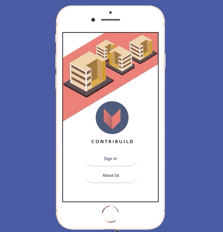
- Application Prototype
- PDF Task History
- Appreciation Token
- Instagram Ad Mock Up
- Booth Mock Up


Final booth layout
May 2019
Motivation

After all the nights of searching for a volunteer opportunity that both fit my schedule and my interests, I found out about the Bone Marrow Donation Programme (BMDP). I signed up and months later I was called to donate my bone marrow. The process took 2-3 days and about 14 days to recover from.
This was the moment I realised I was in quite a lot of pain and I literally went to the extent of donating something that was a part of my body..... all because I could not find a volunteer opportunity that suited me as a busy undergraduate.
That was the moment I realised the idea of donating something always appeal more to me than committing my time and presence for others. It made me want to look into the reasons why and if there were any ways to solve them.
March 2019
12 HOURS AFTER MY
BONE MARROW DONATION
Brand Guide

I opted for colours that were reminiscent of Singapore's local shop houses in hopes that it would steer away from the cliche colours that Singapore is known for. This was a difficult topic as volunteering has the connotation of something only government related and I was trying to make it seem less top-down and more peer to peer.
The logo also had to be related to keywords of "giving" and "caring" but not be too obviously so.
As such, I opted for a more sleeker look and did not outline my logo.

User Testing

Initial Wireframes


User Testing (February 2019)
Wireframe Mock-up 1
5 Subjects
Age range: 19 to 25
Feedback:
-
Everything is too small to read
-
'Back' icon should not be on the right.
-
Red header is jarring.
-
Tap or Swipe? Prototype functions are not clear.
-
There is no brand narrative link between a virtual neighbourhood and volunteering
-
Task listing interface is too messy
-
Too many words to read
-
About page looked too government related
-
Too many functions, what is the main point?
-
Sign up security functions are necessary even if they are troublesome. Facebook sign in alone is not enough.
-
Make it interactive so you can add and follow your friends
Updated Changes

Features


Onboarding Experience
Instead of instantly asking users to
sign up, they look through the app's description and personality quiz to "taste test" if they do want to join.

Singapore Context Narrative
Typical characters from local context used to create narrative for sense of urgency to volunteer – to contextualise one's contribution in their society.

Streamlined Briefings
As ad-hoc tasks are one-off, the goal was to reduce the need for face to face meetings before the task is carried out. Coordinators would host their briefings in a video format with the important details you need. Videos can be taken on cellphones and uploaded to the app directly, so it would be fuss free on both ends.
Icons

Keeping with the overall colour scheme and peer to peer tone of voice, I opted for a more quirky style for the icons used in the mobile application.
